
The sixth book published by Mary Stewart is The Ivy Tree so this is the subject of my sixth book art post. I have shown a few of my Ivy book covers before now, for example in More About The Ivy Tree: Some Book Art but today I thought we could take a look at all of them in one post. As ever, I am looking at my own copies of The Ivy Tree so they are almost all British editions. I am endlessly fascinated by the ways in which Mary Stewart titles were illustrated over time, from the dull to the sublime with some so-bad-they’re-good-or-wait-are-they-just-bad examples. Here we go!
The Ivy Tree in Woman’s Journal, 1961. Illustrated by Andrew Robb


Prior to book publication, The Ivy Tree was serialised in Woman’s Journal, a Fleetway magazine, between June and September 1961. In the magazine, the story is renamed The Master of Whitescar and the illustrator is Andrew Robb, who I believe was this fashion illustrator for the Daily Express newspaper. I think the illustrations are marvellously atmospheric – and he certainly conveyed Con’s good looks, as well as a sense of danger.
1961, Hodder & Stoughton, UK first edition. Illustrator not known.

This novel is illustrated by a photograph of ivy on a plain background and I am not quite sure what to make of it – dull with an eccentric font? The cover art reflects the book title and I suppose after reading the novel we can ponder on who or what the parasitic ivy represents. And at least the cover art doesn’t aim squarely at a female-only market – Mary Stewart was no fan of covers that served to restrict her readership to women only.
1963, The Reader’s Digest Association. Illustrated by Walter Wyles

Just as with the Woman’s Journal serial, the Reader’s Digest abridges Mary Stewart’s writing. So I own these copies of The Ivy Tree partly from a collector’s compulsion but mainly for the joy of seeing her works illustrated. Walter Myles, like Andrew Robb above, has made a fine job of evoking the tensions within the novel. The condensed book has nine gorgeous illustrations, some in sepia tones and others in vivid blue-greens. There is also a page about the author in which we learn that Mary Stewart ‘is, like her novels, attractive, amusing and forthright in her views’.
1964 Hodder paperback. Illustrator not known.

Here our heroine looks like a private eye in a trench coat, hiding behind an ivy-choked tree trunk. And, rightfully, Mary/Annabel is blonde, as described in the book (whereas in the Woman’s Journal serial we are told she is dark-haired).
1968, Hodder paperback. Illustrator not known.

By 1968 (5th impression), we have retained the trench coat and tree trunk but night has fallen and Annabel looks rather different. Personally I prefer this cover although I miss the horse.
1968, Hodder paperback. Illustrator not known.

Same year, different impression – we have moved on to the sixth paperback impression. It is good to see Hadrian’s Wall here, given the importance of setting in Mary Stewart novels. But now our heroine’s hair colour has changed once again, and I’m not even sure if we have a trench coat any more or if it is a yellow dress. And are we seeing a baby pink hat or scarf or…? Whatever it is, it seems very random – could our heroine have been holding a horse-brush but the horse did not make the final illustration?
1968, Nelson Doubleday. The Spell of Mary Stewart. Jacket design by Herb Mott.

Three ‘complete books’ by Nelson Doubleday, this omnibus contains This Rough Magic and Wildfire at Midnight as well as The Ivy Tree. I confess to being swoonily in love with this cover: a great title; a huge and dark old house looming in the background; and an imperilled heroine running for her life, in what is surely a tench coat, through fields and hills of long purple grasses (that conveniently hide whether she is having to run in heels) – fabulous work, Mr Mott!
1972, Coronet paperback. Illustrator not known.

Coronet’s 1970s Mary Stewart book cover series is iconic but this must be my least favourite example. The burned-down building is well sketched but oh! the awful 70s fashion that we are subjected to: the collar on our heroine’s dress makes me wonder whether she is under attack by a gull while his collar and tie are horribly dated. And is his face so much paler than his neck because of strong emotion, pale smoke from the fire or is he channelling 70s icons like David Bowie by wearing make-up? All of these questions could have been avoided by foregrounding and enlarging that ivy tree.
1979, Octopus/Heinemann. Mary Stewart omnibus. Photograph by Robert Golden
This Octopus/Heinemann edition is in my opinion for collectors only. Containing four novels that are complete and unabridged, this book comes in at a heavy and unwieldy 816 pages long.

Not dated but I am guessing early 1980s? Chivers Audio Books. Illustrator Ray Parry.

These audio cassette tapes run to over 12 hours, and the narrator is English actress Jane Asher. I do like how the lightning and the dead branches of the ivy-choked tree reflect one another but I am less keen on the oversimplified lines and colour of the building.
1988, Coronet paperback. [Illustrator Gavin Rowe]

I very much like this book cover: it hints at mystery and tragedy in the story, yet looks like somewhere you would be drawn to explore and find out more about. I think it benefits from not showing any of the characters, since clothing styles date books *tries to to avoid giving the side eye to the 1970s Coronet cover above*.
1998, Coronet paperback. Illustrated by Gavin Rowe

Okay, so this cover uses the same illustration as the book above (in the 1988 edition, the white gate is on the back cover, and on that back cover you can clearly read that the gate is inscribed Whitescar) and this time we are given the illustrator name: Gavin Rowe. I don’t really understand the blocks of green on this cover compared to the full illustration on the previous one but I suppose it has some kind of branding purpose. The previous cover looks far better, in my opinion.
2011, Hodder & Stoughton paperback. Cover illustration Robyn Neild, Gerd Hartung/akg-images

I am not a fan of the 2011 covers set, but this may be my favourite of them, mainly because there are no sickly shades of pink, blue or yellow to offend me. I like too that I am reminded of Little Red Riding Hood, not that that relates to the novel. And as I have stated before, I heartily approve the message that what we have here is A MARY STEWART MODERN CLASSIC. Can’t argue with that!
2017, Hodder & Stoughton paperback. Illustration: TFL from the London Transport Museum Collection
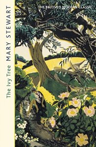
This cover again confirms for me that I simply adore the 2017 book set, with its claim THE BELOVED MODERN CLASSIC, its clean and clear font, and its beautiful vintage illustration. I feel that this set does justice to the elegant perfection of Mary Stewart’s writing.
That is everything in my collection but there are also the US covers that Jerri kindly shared with us here. Here again is the atmospheric Charles Geer cover for The Ivy Tree:

The Ivy Tree, Mill Morrow BCE. Illustr Charles Geer
Do please get in touch to let me know what you think of these The Ivy Tree covers – which is your favourite?
See also:
- Book art: Madam, Will You Talk?
- Book art: Wildfire at Midnight
- Book art: Thunder on the Right
- Book art: Nine Coaches Waiting
- Book art: My Brother Michael


Wow, those ones from the 1961 Women’s Journal are fabulous, especially the sepia one. Lovely!
LikeLiked by 1 person
They really are stunning full-page illustrations, I would love to find the other serial instalments to see their illustrations too (the colour pic is from June and the sepia from August 1961). Glad you like them Sarah!
LikeLike
Thank you, I love your book art posts! I now have the Spell of Mary Stewart omnibus and I am just reading The Ivy Tree for the first time in it. The plot so far reminds me a bit of Brat Farrar by Josephine Tey, though the impostor in that book is a man. It will be interesting to see how the plot continues. I also have a first edition of Ivy Tree and the dw is so dull-looking, which is possibly why I have not read the book before.
LikeLiked by 1 person
Hi Lucina, you are right about the Brat Farrar reference – this is specifically mentioned in chapter 3 of the UK copy of The Ivy Tree but omitted from the US
one (The Spell of Mary Stewart uses American editions. The mention would have come in on p284 where Lisa and Mary discuss impersonation such as Comedy of Errors). I hope you continue to enjoy the book!
LikeLike
Oh, that’s so interesting that Brat Farrar is mentioned in the UK edition! I will look it up in my 1st edition. So I’m guessing the plot will be different in this book… Brat Farrar is one of my favourite books btw.
LikeLiked by 1 person
The American editors seem to have been fond of pruning her writing, I don’t know how often or how much it was done but it is certainly noticeable in The Ivy Tree. I love Brat Farrar too, an excellent book!
LikeLike
Hi Allison
Thank you for a wonderful romp through The Ivy Tree covers… splendid writing! I suspect my first Ivy Tree was the 1968 Hodder paperback but I find the blonde, winsome (overwhelmed?) heroine rather offensive. Mary’s heroines were never drippy!
My votes are for the 1988 Coronet edition (very atmospheric) and the 2017 Hodder & Stoughton … so stylish and elegant. I didn’t know of the 2017 edition but have always loved the stylish TfL artwork. I have immediately asked a friend in London to send it to me!
LikeLiked by 1 person
Glad you enjoyed the wander through the covers, Elly. How true that MS heroines were never drippy, they always stepped up to do what was right. And I love your immediate reaction to the 2017 cover!
LikeLike
Oh I love the map! What month/year is the magazine it is in?
LikeLiked by 1 person
I’m pleased that you like the map, Sally, it is included in the first instalment of The Master of Whitescar, in the June 1961 issue of Woman’s Journal.
LikeLike
I own a 2011 copy, but I really love the Gavin Rowe illustrations – it actually looks very like how I’ve always pictured the Ivy Tree and the Lodge to look. In fact, I’ve found that a few of his illustrations line up with how I pictured settings
LikeLiked by 1 person
Hi Laura! Gavin Rowe is a wonderful illustrator, and I’d guess he must have been supplied with good information to allow him to create such accurate settings.
LikeLike
This is my favorite book ever! I love the Coronet cover and have never seen it. I do have the US Charles Greer book with cover and I think it is my favorite cover. I am so happy it is on Audible now and listen to it a lot. I had never read a version where a baby is mentioned. So weird. Love your website!
LikeLiked by 1 person
I love The Ivy Tree too. Glad you like the 1988 cover, and of course Geer illustrated Mary Stewart’s books beautifully. I think Con played a dangerous game telling Annabel’s grandfather that she had been pregnant with his baby, that could have seen him thrown out of Whitescar, but of course he felt he had to explain her running away somehow…
LikeLike
I have a few of the books and none mentioned a baby. When I downloaded the audible version, it was the first time I had ever heard the “baby” version. I even went back and checked my books. So weird!
LikeLiked by 2 people
I should have made clear: Mary Stewart wrote about Con claiming there was a pregnancy and this was included in UK editions. American editors edited this out, just as they edited out refs to Brat Farrar (which is discussed in other comments on this blog post). In other parts of the world, mention if a baby will depend on whether they used UK/US/ their own edit. Hope that makes sense!
LikeLiked by 1 person
Thank you Allison for posting the book cover of the Ivy Tree. I have a soft spot for the 1968 Hodder ones – these were the ones I read as a 14 year old and I thought the girls looked so impossibly glamorous – something which I was not at the time! Do not like the 1972 Coronet covers – if I were being kind I would say they were ‘of their time’. My favourite has to be the 2017 Hodder TFL one – I think Mary Stewart would have approved of that one as she loved the natural world.
LikeLiked by 1 person
What good comments, Lucy. Does any 14 year old girl feel comfortable in her own skin, I wonder? I started collecting the 60s book covers because I have a soft spot for them too but I think the 2017 set wins for aesthetic appeal and fitting with the books’ contents – and also as you say fitting with Mary Stewart’s love of the natural world.
LikeLike
Hi, Allison! It’s Debbie from Los Angeles. You and I have had some exchanges about travelling to Mary Stewart’s book locations. I am very happy to say that I will be visiting Marseilles on a cruise stop on October 3, which is a Sunday. I would love to spend the day retracing Charity Selborne’s steps at the dock for the boat to the Chateau D’If and other haunts. If anyone knows anything about putting together a walking tour like this, I really invite comment. Maybe there are other or better things to do in Marseilles…but I can’t think of them!
LikeLiked by 1 person
How wonderful Debbie! I’d be interested in others’ thoughts on an itinerary too. I don’t think the book gives enough info to let us figure out exactly where they ate but the harbour/departure point for the Chateau d’If/Canebiere is all in one central area. I can’t recall if Rue Mirabell was a real street, certainly I didn’t go there during my trip to Province and Marseille. I am really excited for you!
LikeLike
Dear Allison, I love the art you posted! The older versions are so evocative of the setting of this book. Referring to another poster’s comment: I also was confused when I picked up a UK version and was confronted with the pregnancy detail which did not appear in the American version I read when I was young. Glad to know it was not just me! As an adult, I went on to read Bratt Farrar and saw how Mary used it in her book — she was so professional and deft in her plotting as well as being an outstanding writer. Thank you for your blog. I’ve been enjoying — and learning so much from — the older posts!
LikeLiked by 1 person
What lovely comments, thank you. I remember being very confused the other way around about the “pregnancy” detail until I found out there are differences between the British and American editions. I’m sure her UK books went out almost entirely unchanged so I don’t imagine Mary Stewart was best pleased by the changes proposed and made by American editors.
I read Brat Farrar as a text at school, aged about 13, and promptly hoovered up as many Josephine Tey books as I could! Such a good book, and I agree that Mary Stewart utilised her reading of it very well in The Ivy Tree.
LikeLiked by 1 person
10/10 for 2017. 1/10 for the audio book with its very un-northumbrian mini White House plonked into the landscape.
LikeLiked by 1 person
Just been introduced to your blog by Meg Perdue’s You Tube review of some Mary Stewart books. I’m also going to share this blog out in the notes of my next Podcast where I attempt to share the joy of Mary Stewart!
I own the 2011 version of The Ivy Tree and love the vintage clothing cover (being a seamstress and loving the vintage mid century look!) but the compulsive collector in me is itching to own the 2017 version, just for that beautiful illustration!
That 70’s version is so bad it’s almost good! It reminds me of books we used to have in junior school, half line-drawn with fashionable teens in strange poses, wisps of something in the background or a brown circle behind the characters… *shudders whilst at the same time is drawn to them* They’ll probably be collectors items one day!
LikeLiked by 1 person
Hello Jane, thanks for your great comments, what you write on the 70s edition made me laugh! Meg is great, I’m glad that she pointed you here. Have you made your podcast on Mary Stewart and is there a link to it that you would like to share?
LikeLiked by 1 person