
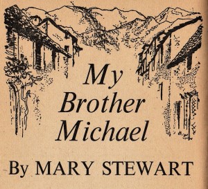
My Brother Michael is the fifth book published by Mary Stewart and is therefore the fifth of my book art posts, where I display the editions I own (pictured above) so that we can admire/fondly mock/look on in bemusement at the ways in which Mary Stewart titles were illustrated over time. Since I live in the UK, my book covers are almost all UK ones, and generally I favour vintage and new copies. Let’s take a look!
Argosy (monthly magazine, part of Fleetway Publications Ltd), November 1959 to March 1960.

My Brother Michael was first published in book form in the UK in 1960 but prior to this it was serialised in Argosy: I think this paperback-sized short story magazine must have looked really fresh and appealing, and all for two shillings and sixpence a month. I have no idea whether Argosy was innovative or whether there were many similar offerings at the time. These five editions contain My Brother Michael and the story is illustrated by William Stubbs.
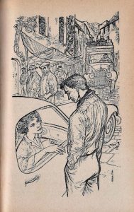


My favourite illustrations here are the village houses bordering the book title, and the scene where Camilla and Simon meet for the first time in Arachova, with its heavily-laden lorry filling the narrow street. (Camilla looks a little like a short person working at the counter of an ice-cream van, and I am perplexed about the narrowness of the front of the car, but to be honest that only adds to my enjoyment of the image!)
1960, Hodder & Stoughton, UK first edition. Illustrated by BIRO.

This is the first of the Mary Stewart books illustrated by Val Biro (1921-2014): you can read more about him in this obituary in the Guardian newspaper. Less florid than the Eleanor Poore illustrations on previous Mary Stewart titles, this cover uses simpler lines and a limited palette to good effect. The ‘young woman in a dress’ theme is present but restrained in comparison to some of the paperback imagery, while the Greek-style font and image of mountainside ruin fragments accurately hint at the story. I believe Mary Stewart would have been quite pleased with this cover: she didn’t want to be pigeon-holed as writing solely for women and disliked some of the more Gothic cover art used on her novels. I like how the spine of the book looks with its single column (see the featured image at the top of this post).
1962, Hodder paperback. Illustrator not known

Here our young-woman-in-a-dress has sneaked forward and her dress colour is bolder, albeit still blending with the tones of the cover. The Greek ruins are in less, um, ruinous condition. The font has reverted to a more standard one and there is a great deal more enticing front-cover-blurb: exciting, unexpected, nightmare, suspense, danger, intrigue! I like the warm colours and impression of a sun-baked landscape.
1964 Hodder paperback. Illustrator not known.

Two years after the previous edition, here the author name is much more prominent in size and by colour contrast. No longer is there information that she is ‘author of…’ – I think these facts point to Mary Stewart being much more widely known by 1964 (perhaps due in part to the success of The Moon-Spinners film that some of you remember going to see at the cinema). The basic illustration is identical to the 1962 edition – but where has our young-woman-in-a-dress gone? Less wordy, this is a cooler, cleaner look – but why does the yellow writing look so cheap?
1965, Hodder paperback. Illustrator not known.

This edition is just a year after our previous example but it has a very different feel. Block caps, no blurb, mostly muddy colours, and the Greek ruins have been relegated to the background. Most markedly, this Camilla is no longer a blurred figure, she is a detailed representation of a woman, someone you would recognise if you saw her in the street. This illustration, with its 60s pointy bosom and hand casually pointing to crotch, seems to me to have been drawn by a man. This illustration might have aged better if it had ended at Camilla’s shoulders..
1969 and 1971, Hodder paperback. Illustrator not known.

I have two copies with this book cover (I have no idea how this is so). This creased cover is a Hodder paperback dated 1971 (9th impression). My uncreased but otherwise identical cover is a Hodder paperback from 1969 (7th impression). Illustrator not known.
Would you agree that Camilla from 50 years ago does not look out of place in 2021? – her hair and dress have not dated at all (or fashion has come full circle). I am not keen on this cover for the Barbie pinkness surrounding the illustration, and because again the male gaze seems so obviously at work here. But I do like the depiction of sky and sea.
1972, Coronet paperback. Illustrator not known.

Coronet’s 1970s Mary Stewart book cover series is iconic. The signature creamy background colour is used really effectively by the unknown illustrator to highlight selected details such as the heroine’s gorgeous hair and one or two plot elements – here, the flower drawn by Nigel plus a Greek gravestone with Michael’s name. And each heroine is exquisitely, glamorously dressed. Camilla’s body language suggests the timidity of her fledgling independence rather well too.
1978, Book Club Associates hardback. Illustrator not known.

Triple Jeopardy is a good name for a three-novel omnibus of suspense and danger, but it does rather suggest courtroom drama to me. This very regal purple and gold cover is a heavy hardback that does not offer any interior illustrations aside from a repeat of this cover one, so I have never used this copy to read any of the stories. I am puzzled by the logic behind some of the other novel collections (eg Peerage Books offers an omnibus of two Merlin novels plus Wildfire at Midnight…) so I am happy that this selection makes sense in that it contains Mary Stewart’s Greek thrillers.
1980, Hutchinson Bulls-Eye paperback. Adapted by Dorothy Welchman. Illustrator: Paul Bryant

I’m not too sure about this cover – those shoes (gasps in horror) but then again: pockets! And is the Giant Forearm of Camilla to be celebrated or denigrated? Inside this simplified version of My Brother Michael there are helpful maps of mainland Greece and Delphi. Instead of the fate-challenging words ‘Nothing ever happens to me’, this version of the novel opens with: ‘The cafe was full of people.’ Hmm.
2011, Hodder & Stoughton paperback. Cover illustration Robyn Neild, Gerd Hartung/akg-images

As I always write about the 2011 covers set, I prefer the Gerd Hartung fashion illustrations with background and context – look here to see what I mean. Is anyone a fan of this custard-yellow background? One thing I adore about these covers? Right at the top, in block caps: A MARY STEWART MODERN CLASSIC. Oh yes.
2017, Hodder & Stoughton paperback. Illustration: Everett Collection/Mary Evans

This cover design set is an instant classic, imo. It boasts a great strapline: ‘the beloved modern classic’, and has a simple clear font – and for me an attractive, easily readable font has become something to be prized; I don’t want to squint at a curlicue title or author name! The illustrations in this set offer a strong hint of glamorous old travel posters, and they are well chosen: in this image, I can certainly imagine Camilla clutching the steering wheel of the car, with a few chicken feathers clinging to the car bonnet…
That is everything in my collection but there are also the US covers that Jerri kindly shared with us here. Here again is the stunning Charles Geer cover for My Brother Michael:

My Brother Michael, Mill Morrow BCE. Illustr Charles Geer
Which is your favourite cover for My Brother Michael? Let me know what you think.
See also:
- Book art: Madam, Will You Talk?
- Book art: Wildfire at Midnight
- Book art: Thunder on the Right
- Book art: Nine Coaches Waiting


My fav is the American one, of course. It could almost be a photo of the setting. Next would be the 2017 Art Deco poster style. Love your descriptions, thanks.
Just read my first two D.E. Stevenson novels. Good replacement for Stewart after all these years of searching for one. No murder mystery or foreign setting, though. Far calmer story line. I can see Downton Abbey being heavily influenced by Stevenson and it is PG rated, which I very much appreciate. BBC could make several miniseries from her works and may have for all I know.
LikeLiked by 1 person
Thanks for your comment, and I like your choices, the Geer one really does look lovely. I have DE Dtevenson at the top of my tbr pile but still haven’t read any, I’d be interested to know which ones you started with? They sound like a tonic, just what we all need in these odd times.
LikeLike
I began with what my library has and chose the oldest because 1/2 of hers are parts of several series. They had the 2 Clementina books and a couple stand alone.
LikeLiked by 1 person
Thanks!
LikeLike
Wow! I’m so impressed with your collection! I thought I was doing well to have one copy of every book. (all are paperback American versions) I’ve read them all so many times they are almost worn out. Oh, I do have two versions of each of the four Merlin books. I recently was able to get a copy of Ludo and the Star Horse, for which I had been looking for years.
LikeLiked by 1 person
Hi Diane, thank you, writing this blog really has fuelled my collector tendencies… I like that you have re-read your Mary Stewarts so often and that you have multiple copies for the Merlin novels! Well done on getting hold of Ludo, have you read it yet?
LikeLike
Oh, yes, I read it immediately. I now have copies of all her works except Frost on the Window, the poetry collection.
LikeLiked by 1 person
That is excellent – it took me years of loving her books before I was even aware of how many she had written, I still feel that I have ‘only just found out’ about her children’s books and poetry! Do you think that you will buy Frost too, or are you less interested in her poetry?
LikeLike
You are so lucky! I’ve been looking for Ludo as well.
LikeLiked by 1 person
Hello Allison, it’s good to have you back!
I would not have known about the 2017 H&S covers if I hadn’t read about them here, since they seem not be available internationally. As it happened, I visited the UK soon after they came out and was able to pick up a few, including this wonderful one. They are all lovely and atmospheric, and, like you, I love the very readable font.
My favourite covers are the Coronets, because those were my earliest Mary Stewarts, but the Charles Geer cover is beautiful. The ’62, ’64, and ’65 ones are odd as they depict what seems to be the Acropolis, not Delphi at all! The 1980 is just plain weird.
I went to Delphi a few years back, purely because of my twenty-year-old obsession with this book, and was thrilled to find it just as I had imagined it, despite the crowds of tourists. Also caused great hilarity among my travel companions by peering down every alley in Arachova to decide where Simon must have first appeared! Not crazy at all- just your standard Mary Stewart fan behaviour. 🙂
LikeLiked by 2 people
Thanks for your comments on the book covers. I remember you mentioned your trip to Delphi before – my reaction then and now being, of course, that I would love to make that trip – but I don’t think you mentioned your effort in Arachova to find the spot from which Simon first appeared. Your ‘peering down every alley’ as part of ‘standard Mary Stewart fan behaviour’ has really made me chuckle, thank you! Do you think you pinpointed the spot?
LikeLike
Dear Allison,
Thank you for sharing all your research and art collation. Until I stumbled across your blog I thought I was alone in my fascination with all things Mary Stewart . I really appreciate your attention to all the small details. I don’t know what it is about the world she conjured up that is so compelling!
My copies are mostly the 1970s Coronet editions. I agree that the Hodder and Stoughton series is a real design classic.
With best wishes,
Tracy
LikeLiked by 2 people
Hi Tracy, sorry – I was sure I had replied to you but I can’t find anything now. Thanks for getting in touch, you will see that there is a community of us here endlessly fascinated by all things Mary Stewart, as shown by, for example,(over-)collecting her books, reading her novels in the seasons in which they were set, spending holidays walking in her footsteps, planting flowers she mentions in her books, buying Mary-Stewart-related related gifts to accompany re-reads, etc etc… I agree completely that she created compelling worlds, and she created loyal readers too. The 70s Coronets are so lovely, and I’m glad you like the 2017 editions too.
LikeLike
Another cover is the Coronet paperback edition (part of Hodder & Stoughton)
It’s a twenty-fourth impression from 1991
I don’t see anywhere to attach it here so will have to email it to you
I also have different covers for Madam Will You Talk and Wildfire At Midnight
LikeLiked by 1 person
Hi Julia, I don’t think I know that cover, is it a favourite of yours? It would be good to see it if you would care to email it. Is it 90s covers you have for the other books too? Thanks for your comments.
LikeLike
What an interesting collection you have, of various editions of My Brother Michael. Some fun cover art. Have you done any checking for differences in editions? For example, for some other authors, serialized “first editions” in periodicals have often been abridged, although the examples I am thinking about where in more general purpose periodicals, “woman’s magazines” and newspapers.
I tried without success to find a US paperback in my stash, but all I seem to have at the moment is the Charles Greer hardback, which you included.
LikeLiked by 1 person
Thanks for your comments, Jerri. What a dangerous question you ask! You are right of course that there are differences between editions – for My Brother Michael, the Hutchinson one is most obviously different as it simplifies Mary Stewart’s wonderful prose. I realise that there might be large differences between UK and US editions (I know this to be the case for The Ivy Tree and The Little Broomstick, for instance) and this really makes me want to buy American copies (with the Geer covers!) so that I can compare them. But that would mean parting with other copies or buying another bookcase… dangerous!
LikeLike
Hi Allison,
Deciding which would be my favorite proves difficult! I very much like both the 1960’s Biro and the Charles Geer. As you said, both give indication of a Greek adventure. I can feel the heat from the sun and almost taste the dust that my sandals have stirred as I walk through the ruins. Biro’s use of the long shadows seems to hint at hidden menace…very appropriate for a mystery novel.
I’m also drawn to the 2017 covers. I do love that while still independent of each other, the books have a similar design…almost art deco feel to them. Your observation of “glamorous old travel posters” was spot on! But I think the covers are a little misleading. Although our heroines may at the beginning of each book set out a on lovely holiday….it isn’t long until the dark shadows start creeping in.
Thanks so much for sharing the intriguing covers with us!
Nan
LikeLiked by 1 person
Thanks for your insights, Nan, I like your take on the long shadows on the Biro cover and then the dark shadows creeping in on our heroines’ holidays. Wonderful!
LikeLiked by 1 person
I have a hardback copy 1960 William Morrow and Company New York. I found it in an antique store several years ago and snatched it up. I’m trying to find the Mary Stewart books in hardback as I need the larger font as I get older! It did not have a dust jacket so I have no idea what was on the cover.
I’ve only read this book once and it was probably about eight years ago so I do not remember the plot. I’m thinking this will be my next MS reread. Thanks for the covers and the pic of your collection! Lovely!
LikeLiked by 1 person
I’m glad you enjoyed the book covers and I hope you will enjoy the re-read too! Please let me know how you get on.
LikeLike
D. E. Stevenson is perhaps my favorite author. Perhaps the one with the most romantic suspense/mystery feel to it is Smouldering Fire. Not the same as Mary Stewart, of course, each has a different feel, but like Stewart, Stevenson has roots in Scotland, and Smouldering Fire is largely set in Scotland. One major difference is that Smouldering Fire follows several different viewpoints over the course of the book. Important to get an unabridged version, either hardback first editions from the 1930’s or the Furrowed Middlebrow/Dean Street Press reissue from the past year or so. All the editions from the 1970’s had entire chapters removed. But this one certainly has romance and suspense and some lovely bits of Scotland.
If in the mood for humor, perhaps the funniest of DES’s works are the Miss Buncle books. Best read in order. Miss Buncle’s Book, Miss Buncle Married and the Two Mrs Abbotts, which might also be called Miss Buncle in WWII.
One difference between these authors is that DES is about a generation older than Stewart. She was born about 1890, and wrote her first (not very good or successful) novel in 1923, before hitting her stride in the 1930’s.
Other suggested good places to start: If you are interested in books set during WWII, The English Air, which deals with events leading up to the war and Spring Magic the early days of the war are great. I could go on and on.
LikeLiked by 1 person
That is so interesting and informative, Jerri, thank you! I had bought two DE Stevenson books second-hand (a couple of years ago when she came under discussion, again with you) but they turned out to be part of a series (The Four Graces is the final Miss Buncle book I think?) I have ordered the first Miss Buncle from Persephone books just this week so I hope to receive and read this very soon. And from what you say, I must track down Smouldering Fire!
LikeLike
I started with a mix of covers for all of Mary Stewart’s books based on whatever I inherited from my grandmother or picked up in second hand bookshops – this could be quite challenging sometimes as I’m not sure if she was as well known in Australia. However, this meant they were already quite well read when I got them, and I’ve had a few fall apart on me.
Over the last year or so I treated myself gradually to a new set – they’re now either the 2011 or 2017 covers. I don’t actually mind the 2011 ones too much, as they remind me of the really lovely illustrations in several books by an author who lives in my local area – Dreaming of Dior, Dreaming of Chanel and One Enchanted Evening. They’re all about outfits in her amazing vintage collection and I can picture Mary Stewart’s heroines wearing some of the outfits from the 50s and 60s.
LikeLiked by 1 person
Thanks for this, Laura, I have read a few copies to exhaustion myself, I always like to see well-thumbed books on other people’s bookshelves – and what a great excuse/reason to buy more Mary Stewarts! I like your perspective on the 2011 covers too, and your local author’s books sound beautiful.
LikeLike
Coming belatedly to the conversation just to thank you for these posts, Allison! So much fun to see the covers and get your perspective. I love the 1960 BIRO cover—one of the best line illustrations of Stewart’s books, I think—and I too like the 2017 series, from the consistency of look throughout to the beauty of the vintage-style illustrations. The cover text is hard to see when one is browsing on a small rather than full-size screen, but that’s a minor quibble. Anyway, thank you again!
LikeLiked by 1 person
Glad you enjoyed the post!
LikeLike