
Last month I really enjoyed gathering together all my Madam, Will You Talk? book covers in one place, and it was great to learn some readers’ thoughts on favourite illustrations. (That post is here.)
So today I am writing a similar post on Wildfire at Midnight, Mary Stewart’s second published novel. You can find out more about the novel Wildfire at Midnight by going to its ‘Page’ (via Bibliography above or in the sidebar); you might also want to play about with the search facility or go to Wildfire at Midnight under Categories – there are about a half dozen posts with a link to this novel. Today’s post is all about the wonderful cover art – or perhaps, weird and wonderful cover art – over different editions of the novel.
1956, Hodder & Stoughton, UK, first edition: You can see the illustrator’s signature, Eleanor Poore – she also illustrated Madam, Will You Talk?, Thunder on the Right and Nine Coaches Waiting. This cover image does not really accord with my idea of the feel or look of Camasunary Bay on the Isle of Skye and I am not keen on all that brown but I am very fond of this book for other reasons: as I blogged before (here), the inner cover of this book has labels that show my copy was once a W H Smith library book; I like that the book price was ’10s 6d net’, whatever that translates to and however it relates to wages of the time; the book cover also informs us about Mary Stewart’s parentage and education – schools as well as university – in relentlessly middle-class fashion; and there are lovely review quotes on her first novel from authors including Margery Allingham and Patricia Wentworth.


1963, Hodder paperback edition, second impression of new edition: I like this cover, Gianetta looks very pensive – and, correctly, she is red-haired. The headscarf and gloves combo are I suppose of their time but suggest rather cold temperatures to me. Their clean, bold colours contrast well with the smudgy flames and smoke behind her.

1965, Hodder paperback edition, fifth impression: I have to admit my copy of this book is in poor condition, with its roughly torn corner, but I can’t part with it. I would guess that the author was not pleased by the pink hues of this cover, and Gianetta’s hair is the wrong colour but it does look gloriously, authentically windswept. Also the hotel looks suitably remote and it is dark night: I think this is nicely atmospheric book art.

1968, Nelson Doubleday Inc, omnibus The Spell of Mary Stewart, including Wildfire at Midnight: if you read my blog regularly, you will know that I adore this cover, illustrated by Herb Mott – look here to see my tote bag and locket that feature this book cover. So Gothic, so purple, so fab!


1969 Hodder paperback edition, eighth impression: again, I like this cover with its brooding sky and mountains. Gianetta’s leg seems to be at a rather improbable angle, or there is something odd about how she clutches it with both hands. The skirt too looks all wrong with its white squares: how stiff would the material have to be for none of the squares to look mis-shapen or to have folded in on themselves? But I love the attitude that has Gianetta, a fashion model, wear pink, brown, green, white, and quite ugly blue shoes – and unlike our earlier cover art, Gianetta is not looking away, she is staring straight back at us.

1969, Hodder & Stoughton, Mary Stewart Omnibus 1: Admittedly, this is a dated cover (and not in a good way) and the title is so unimaginative. What makes this book a favourite for me is its four-page preface by Mary Stewart. An interesting snippet:
Wildfire at Midnight was an attempt at something different, the classic closed-room detective story, with restricted action, a biggish cast, and a closely circular plot. It taught me technically a great deal, but mainly that the detective story , with its emphasis on plot rather than people, is not for me. What mattered to me was not the mystery, but the choice Gianetta Drury faces between personal and larger loyalties.

1978, Heinemann/Octopus omnibus: Hmm. What can I say? The best things about this book are that we are told the illustrator’s name – Robert Estall – and there is a photo of Mary Stewart on the back cover. Otherwise: awful colours and fonts, images that don’t match the books, and it is too heavy to comfortably pick up and read.


1980, Coronet paperback edition, eighteenth impression: what do you think of this book cover? I think the author name is in too large and heavy a font for the size of the paperback, and I am not convinced about the colours in the image: the red rock looks more Australian or American than Scottish. I like this cover, particularly the cloud and sky of the image, but it’s not a favourite one for me.

2011, Hodder paperback. As I have stated before, I’m not hugely keen on the 2011 set of Mary Stewarts, I think the original Gerd Hartung fashion illustrations look much better with background and context – look here to see what I mean. This cover illustration is ©Robyn Neild, ©Gerd Hartnung/akg-images.

Finally, here is a cover that I don’t yet have in my collection of the latest UK paperbacks, the 2017 Hodder: a simply gorgeous cover from font to landscape and lone figure in a boat – a tranquil scene if you don’t realise the meaning of the smoke…

Those, then, are my Wildfire at Midnight book covers, almost all are UK covers and most possess charm of some sort. Which one is your favourite? Do you have a better cover? Please get in touch and let me know!
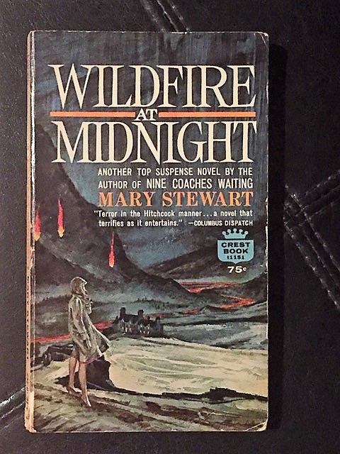
Cryssa Bazos, author of Traitor’s Knot, has kindly sent a photo of her copy of Wildfire at Midnight for me to share. Isn’t this atmospheric? Look at those heels! And I can’t begin to express how much I love the line ‘Terror in the Hitchcock manner’. Thanks, Cryssa!


The 2017 Hodder book cover would be my favourite too.
I began collecting my own copies late in life. My first meeting Mary Stewart was through library books. My copy is a HarperTorch from 2003. The artist isn’t mentioned as far as I could see. Even though I am not fond of only orange and browns it breathes the right atmosphere.
LikeLiked by 1 person
Hodder have done a lovely job of these latest covers, haven’t they? I think I know the book cover you have, in fiery colours? I like it, it is nicer than many of my Wildfire covers.
LikeLike
I definitely love the last one. I have a crest book which was published in Greenwich Connecticut in 1956. I’ll have to find a way to send you the picture.
LikeLiked by 1 person
Hi Cryssa, That must be one of the very first paperback editions – I’d love to see it! The last book in my post is beautiful, it’s just a pity that that is the one I don’t own. Yet.
LikeLiked by 1 person
Alison, I think I read the1969 version; I live in the States.
LikeLiked by 1 person
Hello to the US! The paperback or hardback from 1969? – either way, I like the thought of these Hodder books making their way across the Atlantic. Likewise, I love my few US Mary Stewart books partly because of the distance they have travelled before they reach me…
LikeLike
I have always been a fan of Mary Stewart!
LikeLiked by 1 person
Yay! That is lovely to read. Her writing is just so beautiful.
LikeLiked by 1 person
I agree, and I have read all her books; I’m in the process of recollecting them. It brings back the past and reminds me of my Mother who adored her as well as other “Gothic” writers so popular in those days!
LikeLiked by 1 person
How many have you bought so far? I enjoy looking out for her books wherever I go. Did your mother introduce you to Mary Stewart or was it you who shared your discovery with your mother?
LikeLiked by 1 person
I had every single one, but I moved to a small apartment 10 years ago, and needed to give tons and tons of books away!
I am planning to move again, but I have this desire to revisit certain books of my past. I only have Nine Coaches Waiting, at the moment. My mother was the one who taught me to read at the age of 4 and she introduced me to all kinds of genres, but the Gothic Mysteries seemed to be her favorite.
LikeLiked by 1 person
I’m sure that de-cluttering is good for us all but a book cull has to be the most difficult part! It’s lovely that you and your mother shared so much reading, there must be a trove of memories in that.
LikeLiked by 1 person
You must be a fan of Mary, Queen of Scots.
LikeLiked by 1 person
She is an enigmatic character, I’m never entirely sure what to make of her! On the other hand I know I’m *supposed to* admire theologian John Knox who wrote against female rule, wanted Mary Queen of Scots executed, and married a 19-year-old girl when he was in his 50s. Ick.
LikeLike
There have been many books written about her as part of the Tudor Canon.
Ick is right!!
LikeLiked by 1 person
Thanks for putting up my cover, Allison. Inside it says that it contains the complete text of the original hardcover edition.
LikeLiked by 1 person
Thanks for the cover and the info!
LikeLiked by 2 people
I have the Hodder & Stoughton 8th impression and like you, I love Gianetta’s red hair and her strange frumpy clothes. But sadly, my copy has the front cover ripped almost entirely off (it’s been loved too much) so I am in the market for another. I’m tempted by the 2017 version – I just love the way they’ve quietly included the detail of the smoke. Annabel
LikeLiked by 1 person
Hi Annabel, I admire your good taste! I don’t know yet when the 2017 cover will be available, I’ve only seen it for the ebook so far. Hopefully soon 🤞
LikeLike